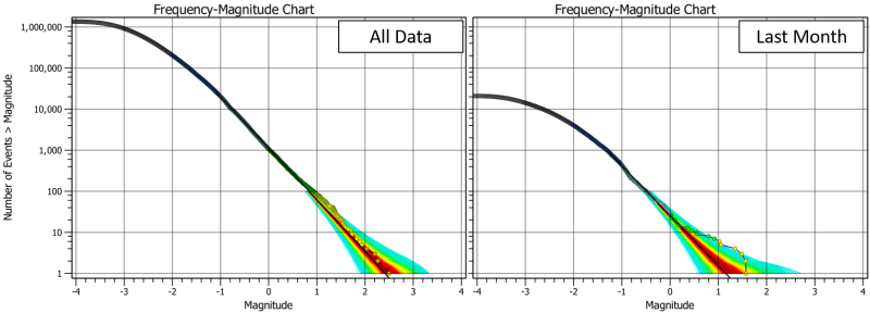
Charts usually auto-adjust their ranges to the input data. This is often what you want, but occasionally it does make it harder to compare charts with different filters applied. A handy tip is to enable the ‘Zoom and Pan’ option in the top-left. This disables the auto-zoom and pan so then if you change the filter, you can compare the two charts. An example below is the frequency-magnitude chart for all events, compared with the events for just the last month. Enabling the Zoom and Pan means the axes remain the same for both charts.
You can also zoom and pan to a different area. Remember if you scroll the mouse in the chart itself, it zooms both axes together. You can zoom a single axis independently by scrolling on the axis label area.