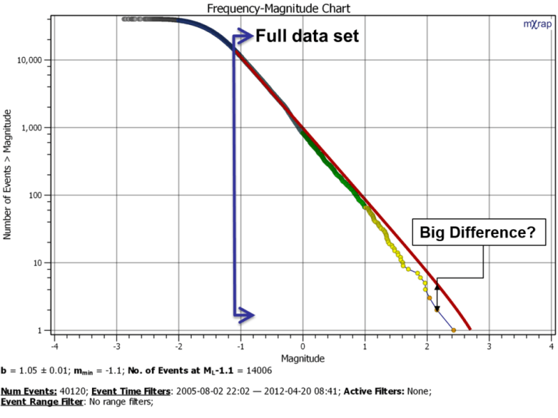
When you are using the frequency-magnitude chart, it can be easy to forget it is log scale and this can distort a few things. Consider the chart below; have you ever thought the Gutenberg-Richter distribution doesn’t look right? Think it isn’t matching the large events very well?

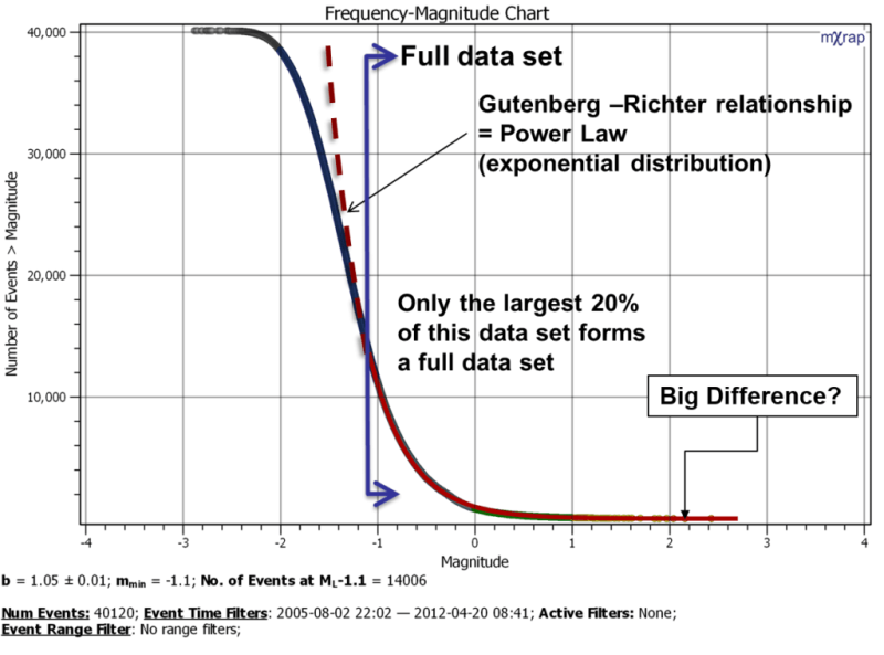
The Gutenberg-Richter distribution is a statistical model of the data. Consider what the chart looks like in linear scale rather than log scale. The difference at the tail of the distribution (largest events) seems much less significant right? The other interesting point is the relative proportion of events above and below the Mmin. There is roughly only 20% of events in you database that are above the magnitude of completeness.
Obviously, in linear scale, you can’t see what’s happening at the tail very well. That’s why we use the log scale in the first place 🙂


